You can also listen to this article in the voice of own Plastic Artist Rosângela Vig:

The first colors that caused me great impression were the light green and full of SAP, White, the Crimson-Red, the black and yellow-ochre. These memories date back to my three years. I saw these colors on different objects that today do not see as clearly as their own colors. " (KANDINSKY, 1991, p.69)
Step by step 3 of how to draw

Still in childhood, Kandinsky 1 already revealed a differentiated perception of the world. His talent, associated with the keen sensitivity and passion for color, They illustrate the most beautiful abstract works. The colors, as trademarks of your abstraction, distribute harmoniously in his works, revealing a larger goal of his art, to take the painting to the condition of music. And it's easy to be charmed by the art-Kandinsky music. Its pure colors swirl around in the midst of geometric shapes and lines, and everything seems to move a self-perpetuating attempted accommodation, as if the work got life, movement and spiritual significance. Kandinsky knew the importance of the use of color and its effects in a work. And the color should be seen as an element of life in art, Why does everything have color, everything has nuances.
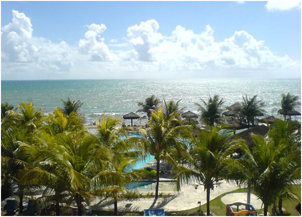
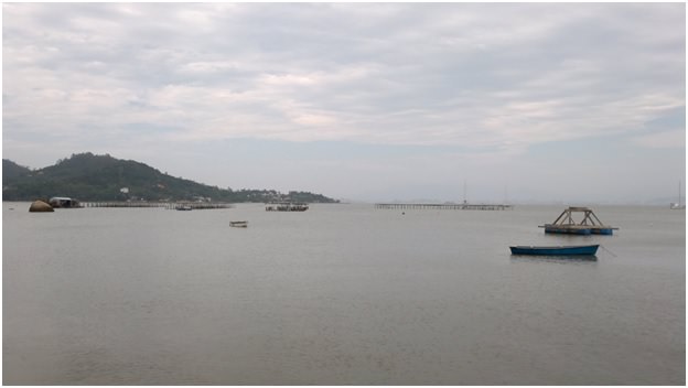
With a more refined look, one can understand that a late sunny afternoon is yellow and the sky if tinting of different colors (Fig. 1); that nature if tinting with different shades of green during the seasons; the sea in sunny day is blue (Fig. 2) and on cloudy day is gray (Fig. 3); and even a blank sheet may not be fully alva, because receives the colors of lights that illuminate.
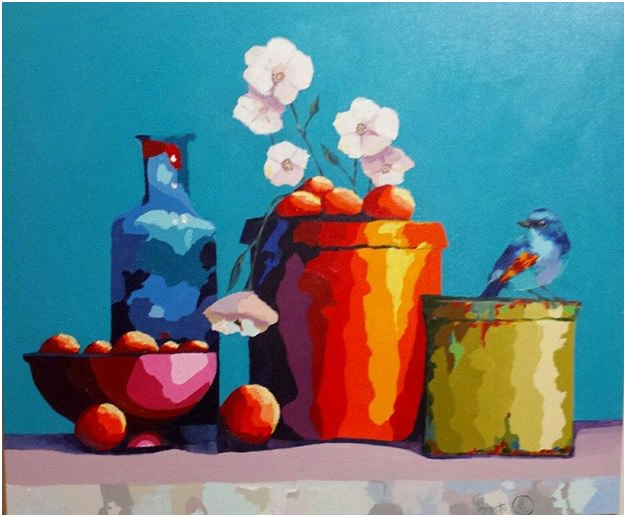
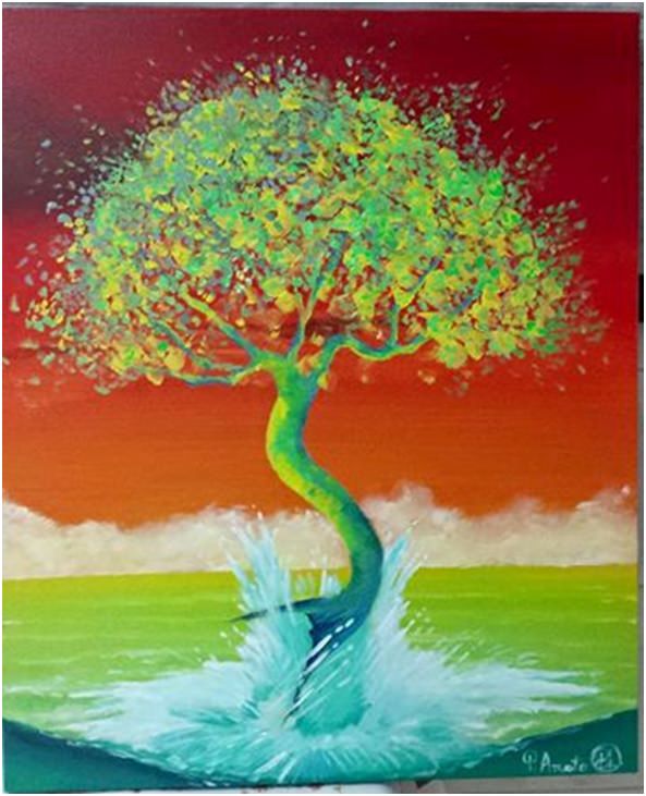
This perception of colors on objects was very well represented in Figure 4. Bright points of each object are given lighter shades of the same color and, in areas where the light does not affect, the tones are getting gradually darker. The amazing effect of work consists of no mixture of colors, the nuances are pure, If not merge, What makes the work even more beautiful and unusual. In figure 5, the warm colours of heaven referring to the idea of heat, a late afternoon. The light permeates the tree that emerges and what colors of yellow. Not illuminated points vary between shades of blue and green.
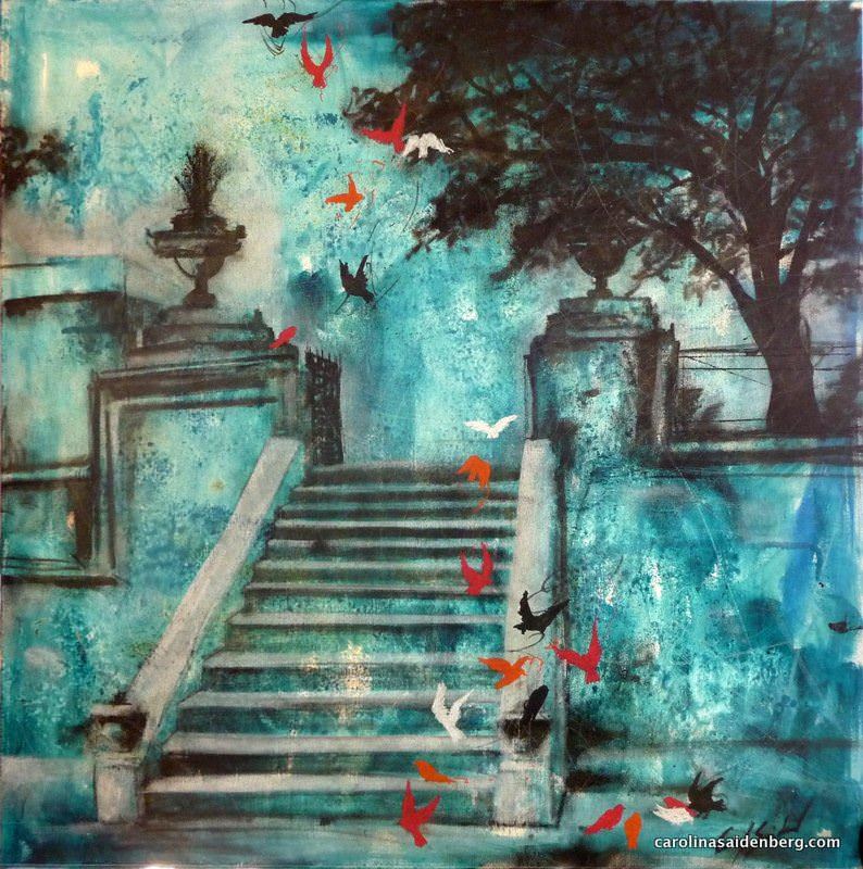
And, as an element of life, the colors can still be well combined and contrasted, to promote a beautiful effect at work and a pleasant impression when looking. In the work of Carolina Saidenberg (Fig. 6), the seriousness of blue and black, on the ladder and the wall, is broken by the birds in pure colors that, in flight, less smooth and take life to the scene. The perfect combination of shades allowed charm and poetry of the work.
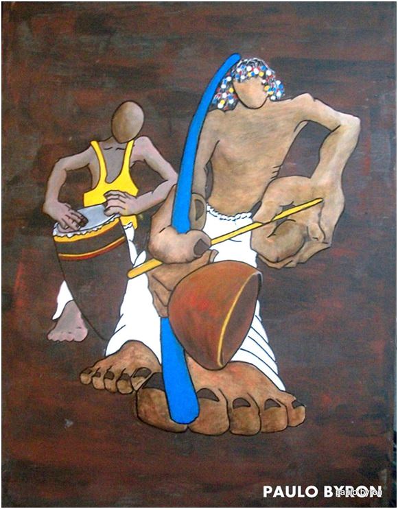
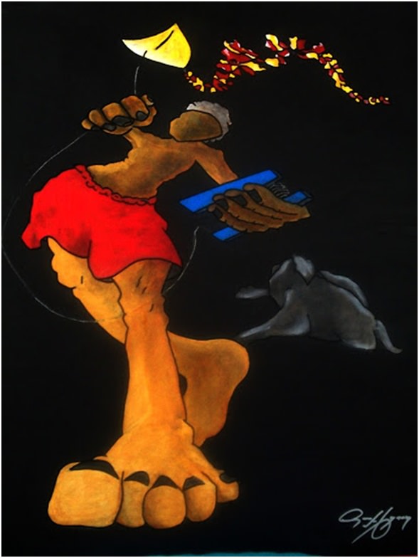
His color is also present in the works of Paul Byron (Figures 7 and 8). In figure 7 the artist used Brown Fund following the shades of skin of the characters, but invested in pure colors to create a scene lively and full of movement. Even under the black background, the figure's boy 8 seems to fly a kite in lit, such is the effect provided by looking, by the use of primary colors 2 and clear in the midst of neutral colors and dark.
The contrasts and combinations of colors are details that draw the eye to a work. For Kandinsky:
As in combat, as in battle, they're coming out of the tube, These fresh forces, young replacing the old. In the middle of the palette there is a strange world; the remains of the colors already in use that, far from this source, wander through the screens on necessary incarnations. There's, a world that came into existence by the will of the painter, for the already painted frames, but that was also created and determined by accidental causes, the enigmatic game of strange forces the artist. (KANDINSKY, 1991, p. 91)
To the artist, It is figure this hidden world, decipher their codes and take its nuances to a blank screen, freeform, spontaneous. To him, It is the Mission of listening to your spirit and make use of colors and shapes that represent your thinking and the world that surrounds. The beholder, It's up to delicious mission to enjoy and to entrance.
1 Site with works by Wassily Kandinsky: www.wassilykandinsky.net
2 Primary colors are the basic colors, red, yellow and blue. Other colors originated from the primary.
.
.
…
Liked? [highlight]Leave a comment[/highlight]!
You might also like:
The figures:
Fig. 1 – End of late afternoon, effects of Sun on the clouds, with orange and yellow colors. Photo of Rosângela Vig.
Sign up to receive Event News
and the Universe of Arts first!
Fig. 2 – Sea in sunny day, Photo of Rosângela Vig.
Fig. 3 – Sea in cloudy day, Photo of Rosângela Vig.
Fig. 4 – One strange in nest, Patrícia Amato.
Fig. 5 – Nature Emerged, Patrícia Amato, 2015.
Fig. 6 – Staircases, Carolina Saidenberg.
Fig. 7 – Berimbau, Paulo Byron.
Fig. 8 – The Wind Flavor, Childish Games Series, Paulo Byron, 2013.
ROSÂNGELA VIG
Sorocaba – São Paulo
Facebook Profile | Facebook Fan Page | Website
Columnist at Website Obras de Arte
E-mail: rosangelavig@hotmail.com


Drawing – Study of Colors, Step by step 3 of how to draw by Rosângela Vig | Website Obras de Arte
http://t.co/FQVJVYAber
Drawing – Study of Colors, Step by step 3 of how to draw by Rosângela Vig | Website Obras de Arte… http://t.co/J1kvYOvApA
Extra Extra Extra!! Drawing – Study of Colors, Step by step 3 of how to draw by Rosângela Vig http://t.co/6lZBeetB9C
Drawing – Study of Colors, Step by step 3 of how to draw by Rosângela Vig http://t.co/nSpYnsZS0c
Friends, glad my Works have been cited regarding the site works of art. See:… http://t.co/0JocWyPNlU
I would like to share my new article on works of art… http://t.co/kKlut5ShY9
Drawing – Study of Colors, Step by step 3 of how to draw by Rosângela Vig http://t.co/9CrYEXpIbX
Excellent study! Like you always do, Rosângela exposes the ideas of teaching form, clear and objective. Thank you!
Hello Malu, Thanks so much for your comment, a big kiss to you.